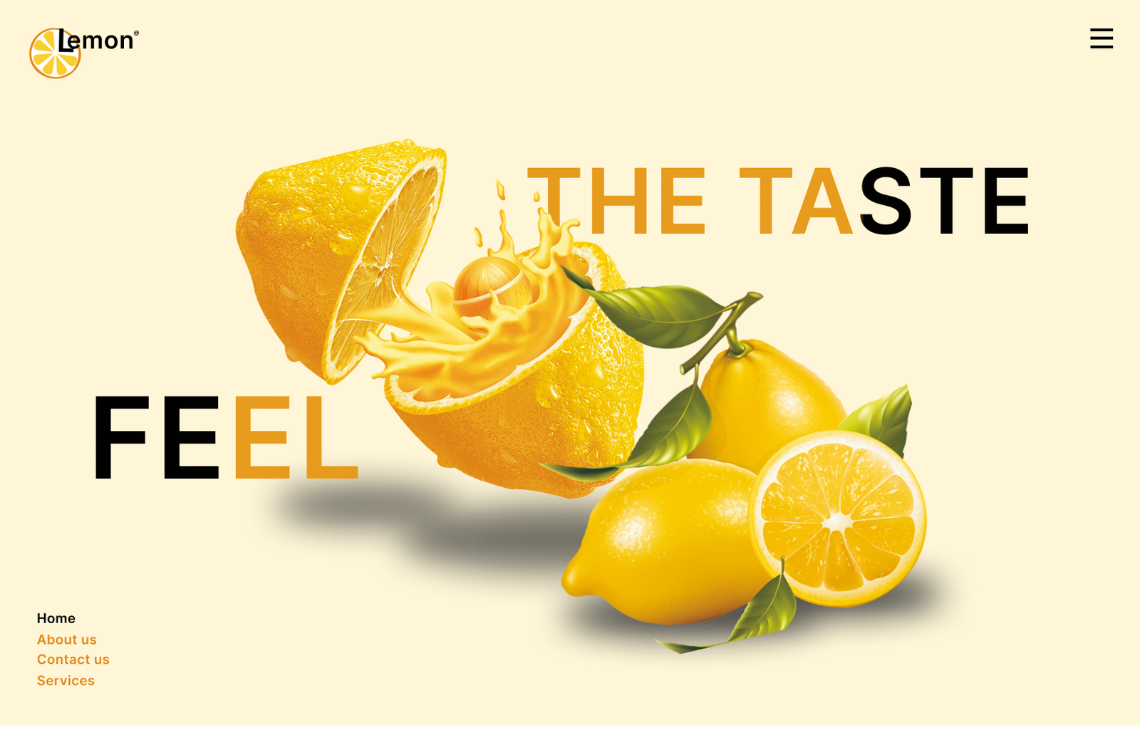
Some of webdesigns, I’ve made in figma on topics ranging from sign
up/in pages to calender to checkout to music players or product
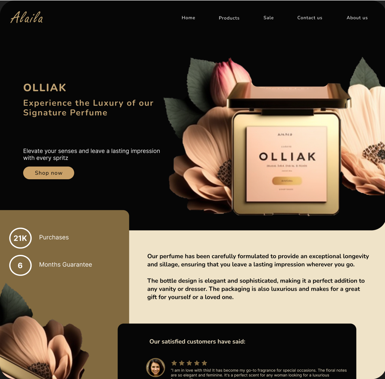
The idea stemmed from when my mother bought an expensive imported perfume online from Amazon.
I challenged myself to make a luxurious website that was solely for high end eco-friendly perfumes as many perfumes till now release CFC and pollute the air.

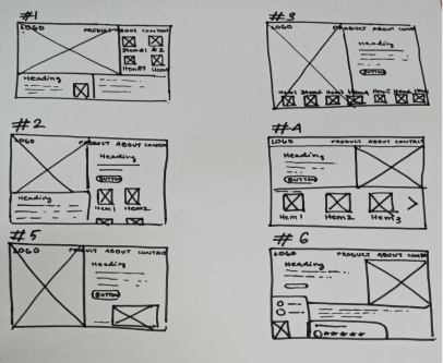
Wireframes that I made for the site after researching a few perfume websites.
I wanted the perfume to the be the hero image and the main focus. I
made around 6
of them and selected the last one because it had balance of both
picture and writing.
I selected earthly and neutral colors, such as whitish beige, greenish
gold, gold and black to make it aesthetic and
luxurious because these exude a sense of simplicity, elegance, and
sophistication and to give a vibe of eco-
friendliness. I also added golden hues to give feel of royalty.


.png)
The final product after adding the hero line,
tagline, features and customer reviews
I am an abuse survivor and have terrible
ptsd. Before, I couldn’t sit still without
dissociating and having intrusive thoughts.
Music especially nature sounds helped me
a lot with all this.
I tried to make a calming
music website focusing on
relieving anxiety, stress and
alleviate symptoms of other
mental health conditions.
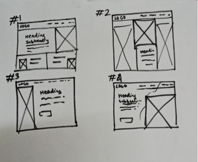
Wireframes that I made for the site after
researching a few music websites. I wanted the
illustration to the be there with some texts. I
made around 4 of them and selected the first one
because it had balance of both picture and writing.
I used warm colors to create a welcoming and comforting atmosphere that can
help to reduce feelings of anxiety
and promote feelings of calm and relaxation. Warm colors are typically
associated with feelings of comfort, joy, and
safety, making them an ideal choice for a mental health website.
Inter
I used Inter script to make the logo because its
clean, modern and readable design.
Neucha
I used Neucha script font because it looked
comforting due to its handwritten style. The
handwritten style of the font evokes the feeling
of someone writing a message creating a sense
of connection and support
I named the logo “Serendipity" meaning "pleasing and unexpected discovery".
It suggests a sense of serendipitous finding of inner peace and relaxation
through music.
I used white color for logo to make it simple and convey peace and sense of
space and openness.
.png)
I made the images in Midjourney using prompts.
I also photoshopped the two of the images ie. the leaves and the phone like
interface.
I wanted to make it seem like the sounds of nature forming out on a phone.
The final product after adding the hero line, tagline and features.
 1.png)

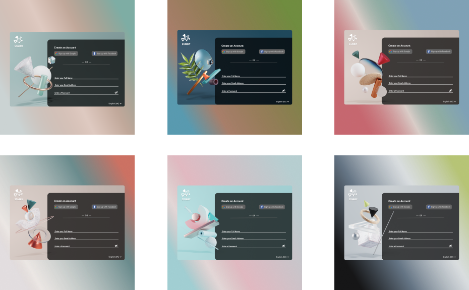
SIGN IN/UP PAGES
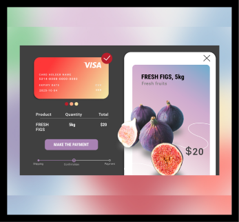
A checkout UI of a grocery/shopping app
I tried to make a popping out effect of the item and even applied shadows to
accentuate it. Added a credit card as well. I applied a lot of gradients
using teh colors already present from the layout
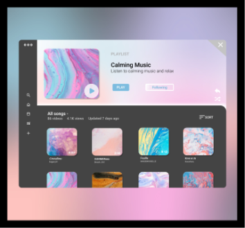
A music player
I was trying to make a music player using features that I found to be more
accessible and more comfortable. Like the nav bar is on the side and the big
obvious icons. It bears resemblance to youtube since initially I was trying
to make a mockup of youtube
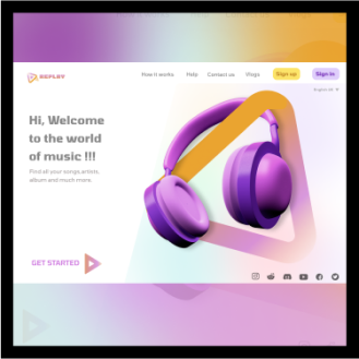
Homepage design
One of my very first designs, I was trying to make a unique popup with the
png in photoshop and figma.
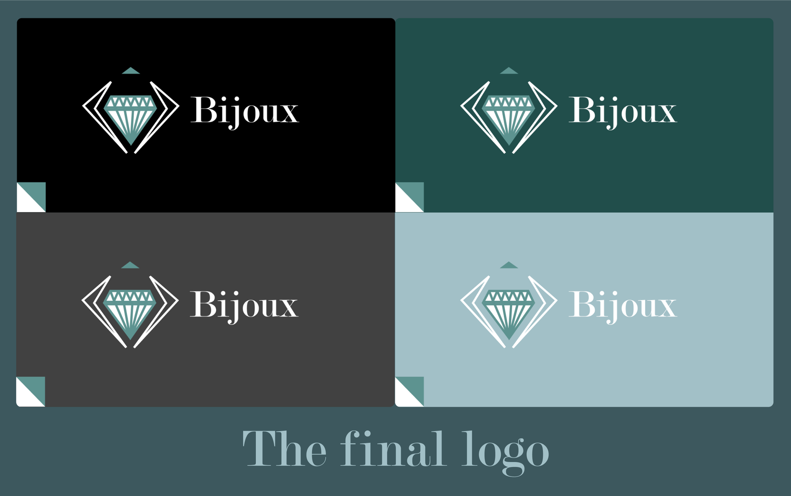
I made this logo of jewelry shop as apart of Daily UI practice.
I got this idea from my aunt who is an astrologer
and she
recommends
different
jewel
stones
according to the birth dates and occasions.
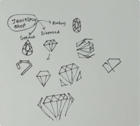
Initial sketching of Ideas. I choose
diamond as
the main image as
diamond
is often
the first that comes to the mind
when referring to jewelry and stones.
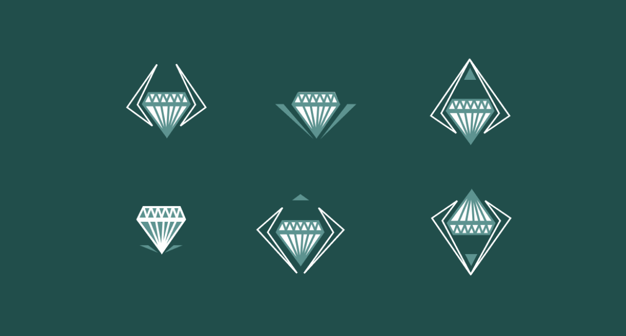
First draft: The diamond it self looked very simple so, I added pointy motifs resembling a diamond.
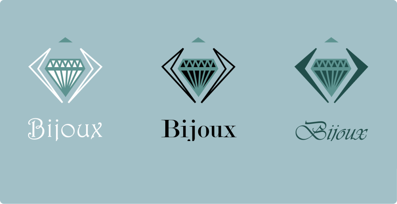
Stylish but feels informal
Sharp edges of
font match
the pointed edges of logo
Cursive is
really stylish but
the readability drops down a
bit

I choose the
bijoux from french meaning jewelry.
I selected the Modern No. 20 because it has pointy edges matching my
logo
and it also looked formal while having the vibe of intricacy.
